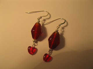
I've been working really hard at improving my photos. This is something I'm striving to perfect. But just when I feel I am happy with them, I tire of looking at them... and perhaps others feel the same? I think it's important to keep a shop fresh, not just by adding new items, but by sprucing up the display to keep the browsers interested.
I think my photography skills have come quite a way since my earliest attempts. My first attempts were awful:

But I soon started to learn about lighting and began to take them on a windowsill.

Then a lovely man, photographer JimJuris advised me to download GIMP and very generously and patiently guided me through the basics. I'm slowly learning how to use the various functions, and although I am improving, the results are still very hit and miss. But I have him to thank for getting me started, otherwise I really wouldn't have a clue about editing photos.
So after much experimenting, I improved. But I became complacent, opting for plain black or white backgrounds, an overhead shot as the main picture, and a few shots from various angles.


I was taking photos with the prospective purchaser in mind, making the pictures clear... but not very interesting. My views were low, bounce rate high, and Treasury inclusion virtually none existent!
It was the very talented artist Illusio who came to my rescue. She provided links to some excellent articles on photography, and suggested I check out other successful Etsians... the ones who always seem to be in Treasuries, and compare my photos with theirs. To do this I used a Poster Sketch; a very clever and useful tool for making Treasuries, but also ideal for making side by side comparisons of similar items.
I decided my photos looked boring, and although essentially telling the viewer everything they needed to know, it also gave them an excuse not to click on them which would effectively take them to my shop. I liken it to the jacket of a book providing a detailed synopsis and telling you how the story ends... giving you no need to turn the pages to find out!
So I decided to have a go at using props to "dress" my photos... make them more inviting! I searched the house for suitable props.. small trinket boxes and visually interesting objects, and composed an old fashioned letter on cream card in a fancy brown font to add a touch of vintage style romance! I actually enjoyed that bit... but that's the writer in me!!
Using props isn't as easy as it sounds when photographing tiny objects such as earrings, as there is the danger the prop will dominate. I'm still not entirely happy with some of my shots... too much prop showing in some, not effectively marrying the prop to the item in one or two, and terrible lighting in others. The latter hasn't been helped by the recent awful weather, so I've had to make do with a windowsill and more editing than I would have liked. I tried to construct a lightbox, but found its use far too fiddly and restrictive. I plan to re do some when the weather improves so I can take them in natural daylight, which is my preferred light source.
Here is a selection of some that I feel are OK'ish:


It's been a long, hard slog... I'd much rather be spending my time working at my bench making jewellery than taking and editing photos, but it's all a part of the learning process and hopefully improves the look of my shop. I've recently been included in some lovely Treasuries too... not sure if it's due to the new photos, or my bribes of cake that did it... but I am very grateful! :)
You can check out the rest of my photos in my shop here.
Hi I love your Jewlerey it delicous! Im new to your site and a Style Consultant based in the UK,if you think you might be interested in featuring on the My Passport to Style site, please email at sharonstyle@fsmail.net Sharonxx
ReplyDeleteThe new pics are brilliant! Really eyecatching
ReplyDelete